Wednesday, March 17, 2021

Feeling Daffy


Feeling Daffy

6x6 soft pastel


I didn’t especially like this piece...until the next morning.  Then I decided it was ok.  Sometimes you have to step back and look at it with fresh eyes.

Tuesday, March 16, 2021

Ladies In Waiting

 Ladies In Waiting

9x12, soft pastel


Day 3 of the #pswc21n21 challenge: Sunrise on a farm...”ladies” quietly waiting to give birth in their separate paddock. It was a beautiful scene several years ago when I took a few pictures as I drove around the countryside. The sun way just coming up and softly highlighting these gals.  They were simply beautiful!

Spring Is Here

Spring Is Here
6x6, soft pastel


There is a 21n21 challenge this month sponsored by the Pastel Society of the West Coast...so, my main theme will be spring flowers...although knowing me I will most likely deviate as I make my way through the next 3 weeks.  One bit of good news....I won 3rd place for my teapot scene “4am, Comforts of Home” in the PSWC member show. And, along with that, I earned signature status!  Hurray!  


Friday, March 12, 2021

Catching up!

 Well....I painted several paintings in January that I failed to blog about...so in the spirit of catching up, I’ll post them now.  Fortunately, life is getting back to normal lately.  A very good thing indeed!
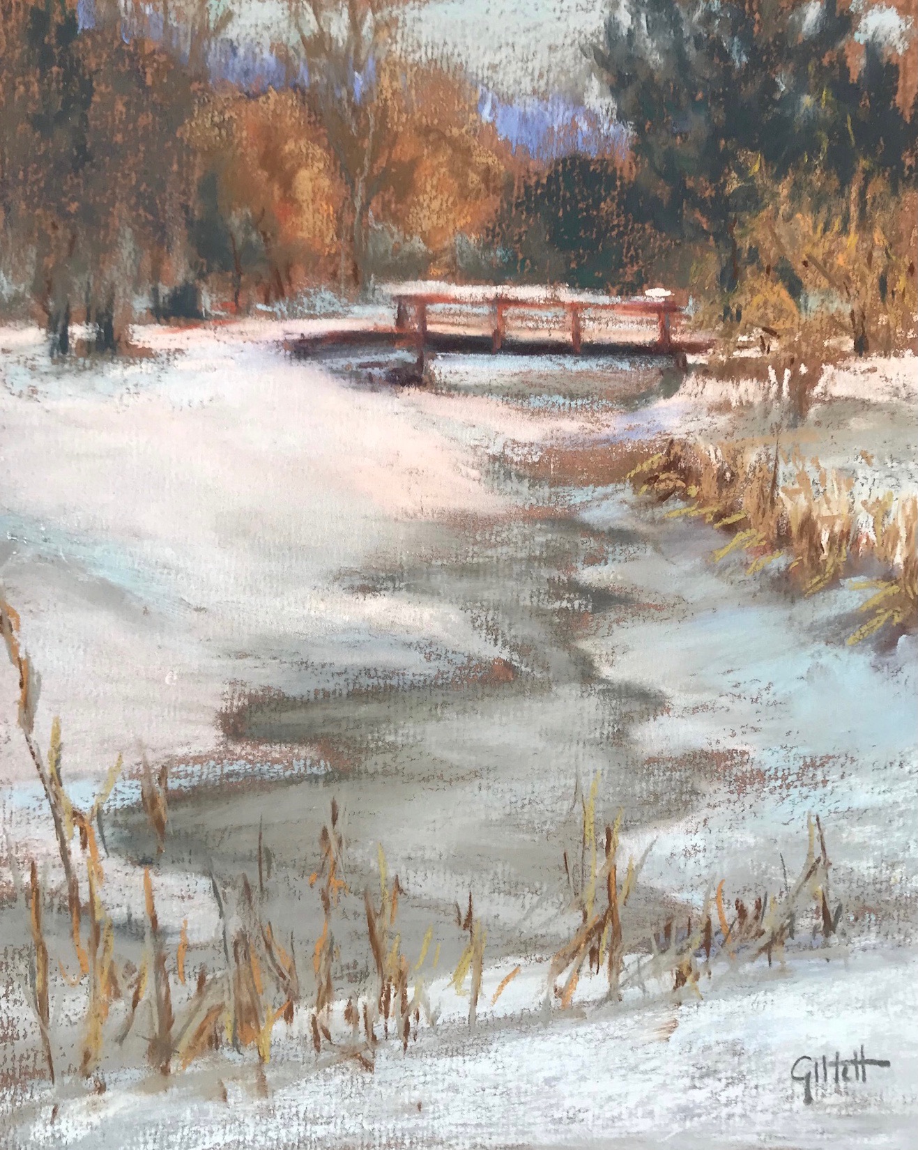
Footbridge In Snow

8x6, soft pastel


The Final Bloom

8x10, soft pastel


Little Brown Vase

6x6, soft pastel


Little Brass Bird

6x6, soft pastel


Taylor Made

12x12 soft pastel


Thursday, March 11, 2021

Indian Spices

 Indian Spices

8x11 soft pastel


This isn’t the best picture of the painting...but, it’s already on its way to a new home. This one was another fun project. My sister-in-law is from India and is a fabulous cook! She uses lots of spices...so it’s a very fitting piece for her kitchen. The actual spoons are warmer in color than this picture shows...more like real wooden spoons but hey, I never claimed to be a great photographer. 😊


Wednesday, March 10, 2021

Colorful Marbles

 Colorful Marbles

8x12 soft pastel


This piece is very similar to one I did a few years back. I love  all the vibrant colors of the marbles. Some of them are considered “glass balls” and not marbles. But, there are a few large marbles and a few smaller  ones thrown in.  I love the glass ball in the middle because you can see through it.  It was a fun one!

Friday, March 5, 2021

Varenna Italy Evening

 Varenna Italy Evening

32x48 oil on linen

The days of my life were filled to the brim painting this piece during the fall and early winter months of 2020.  I typically started painting at 3-4 am and worked on it for 8-10 hours a day, feeling like the day was over by noon. It was a labor of love as the pieces fell slowly into place. Being primarily a pastel artist, painting a large oil painting was a significant challenge...but a good one, and ultimately a satisfying process. I’ll post below my progress shots.

First I had to convince myself that I was capable of purchasing the necessary Belgium linen, stretcher bars and tools online and stretch the canvas myself. Up until now, I had always purchased ready made canvases. Thank the good Lord for You Tube! Once stretched, I applied a very light layer of water on the back and voila, the canvas was stiff as a drum.


Next, I painted two studies...one in pastel and one in oil.  The pictures are poor, but you can see that they were painted very quickly (1/2 hour to an hour each)...I did this mostly to play with how high or low to place the town for the best composition and as color studies...since I was trying to convert my client’s daytime photograph into a night scene, extending the waterline to show nighttime light reflections was a must.  I searched the internet too for more photos of Varenna in order to determine where all the street lights were and what the restaurants looked like filled with people.


The oil on the left shows the town quite low, the pastel on the right shows the town quite high...so I settled for somewhere in the middle.  After evaluating the studies, I toned the canvas and then spent two days sketching the scene onto the canvas.  Once the scene was sketched, I felt all things were possible...and the painting began.  First, blocking in base colors and checking for values...at one point I turned a photo to black and white to ensure the values (especially the water, were correct for a night scene).

Day after day I moved from foreground, to the waterfront buildings, to the hillside homes, to the mountains and sky and back...blocking in, adjusting values, repainting some areas, and finally the best part...adding the details. In some shots there are empty restaurants which are populated later with people.  In other shots there are buildings with no lights...only to be added at the end to suggest that people do indeed live in those homes. It was fun imaging what was happening in each little vignette. 


Once deemed finished, it hung for some time in the studio to dry. Finally, it was time to varnish. (Thankful for You Tube videos once again). I mixed a solution of 2 parts Gamvar Gloss to 1 part Gamvar Matte and varnished the painting flat. Although the photos aren’t great, you can get an idea of the impact on a painting that varnishing provides. The paint dries fairly matte...but once varnished the paint looks wet, the details come alive, and the colors are much more vivid.


The last step was to photograph the varnished piece. All along the way, photographing a wet painting was nearly impossible due to glare...add varnish, and it’s even harder. So, back to You Tube and the internet to see what type of camera equipment I needed to get a good photo. Turns out that using circular polarized lens was the answer (I bought one for my Nikon camera and one for my phone lens on Amazon)...along with placing polarized film in front of the lights I used (placed at 45 degree angles from the painting). You can see the difference in the two photos below taken from my phone (the left without a filter and the right with a filter).  The glare on the left completely washed out the painting, with a polarized lens on my phone it looked much better. The effects were even more dramatic with the Nikon camera. The final photo from my camera is below.  I’m still not sure it’s the very best photo of the piece because to me, the painting looks much better in person...but it will have to do.
The painting is now with it’s owner and I have to say, I miss seeing it...especially as the sun sets in the room where the painting hangs. It gradually darkens as though the sun is setting in the painting itself...until eventually, all you see are the reflections on the water.  Such a peaceful sight!

In a completely dark room


The end....I hope you enjoyed reading about the process.